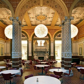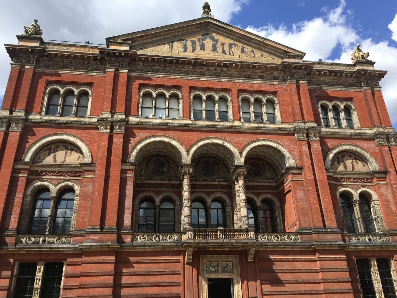
Although the V&A is one of my favourite haunts in London. My memories of awful « restaurants » in the Kensington museums when the kids were toddlers always kept me away from having any kind of meal in one of them… But there is good news: the London restaurant scene upgrading has also widely touched the Kensington museums and the V&A has now a very nice cafeteria serving nice fresh food. Anyway, the scenery in itself is enough to make you want to sit there and contemplate no matter what food is served…
As the V&A website tells us: http://www.vam.ac.uk/content/articles/a/architectural-history-of-the-v-and-a-1863-1873-fowkes-architectural-master-plan-an-interrupted-vision/
The Refreshment Rooms
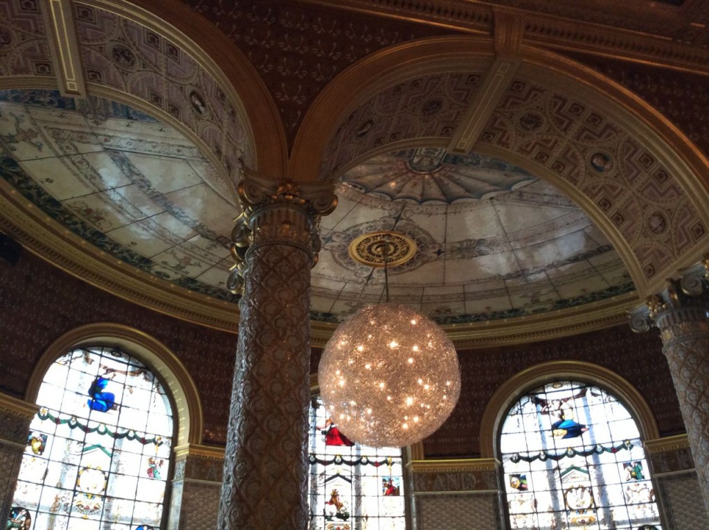
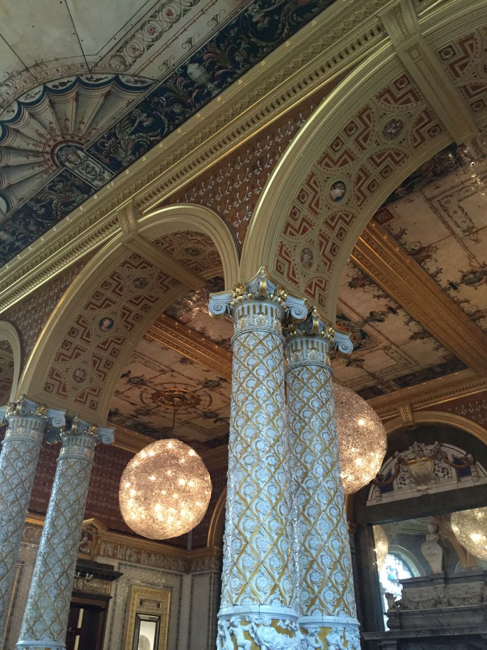
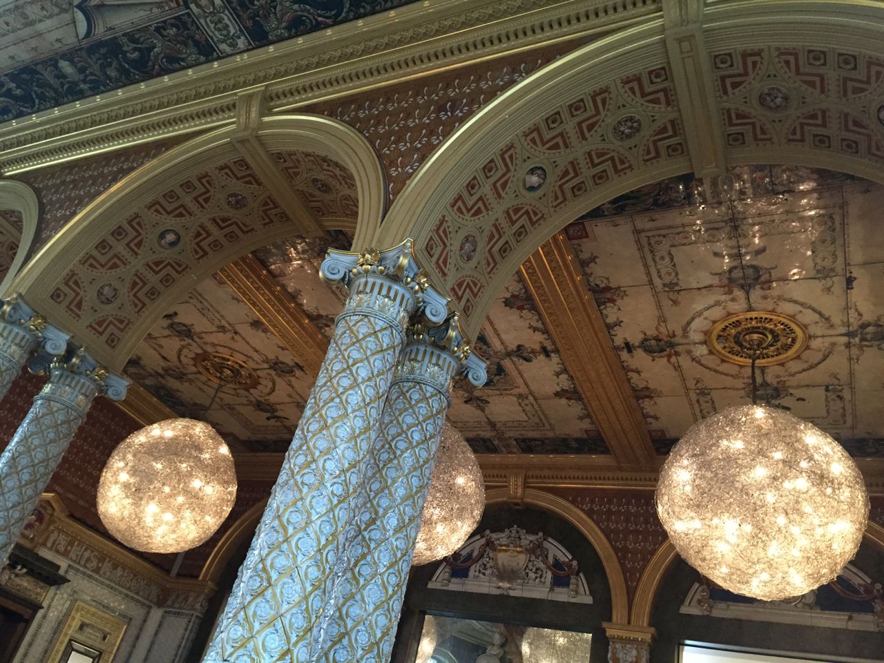
The Gamble, Poynter and Morris Rooms are interlinked rooms that made up the restaurant of the South Kensington Museum. These rooms are today again being used as part of the Museum’s Café. Although they were functional spaces, the Refreshment Rooms belonged to the Museum’s public face, so they were also given some extremely lavish decorations.
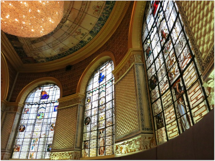
The Gamble Room
This was the original Refreshment Room. It would have been the visitor’s first view of the Museum’s interior and even the Victorians would have been struck by the extraordinary decoration. The main doors to this room were immediately opposite the main entrance of the Museum. Cole’s concept of a museum restaurant was completely new, a world first for South Kensington, yet another way of getting people to enjoy culture.
Henry Cole was responsible for many innovations: the V&A was the first public museum in the world to be artificially lit so that workers could come in the evenings. (In the ceilings of some rooms the ornamental metal gratings which took away the heat and fumes from the open gas jets can still be seen.) The ventilation grilles in the ceiling of the Gamble Room are surrounded by enormously heavy and ornate enamelled iron plates. Cole is thought to have got the idea from the enamelled name plates on railway stations. Here, with the ceramic tiled walls and columns, they were a hygienic, washable covering for an eating place and also formed a fireproof cell within the museum. The Victorians were very conscious of the dangers of fire. It would have taken horse-drawn fire engines a long time to reach South Kensington, still a very rural place in the 1860s. As an additional precaution, food for this main refreshment room was prepared in kitchens outside the walls.
The windows are full of Victorian maxims and mottoes about the joys of eating and drinking, such as such as ‘Hunger is the best sauce’ and ‘A good cup makes all young’. The frieze with its inscription from Ecclesiastes II, 24 reads ‘There is nothing better for a man than that he should eat and drink, and make his soul enjoy the good of his labour – XYZ.’
The Poynter Room
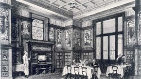
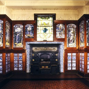
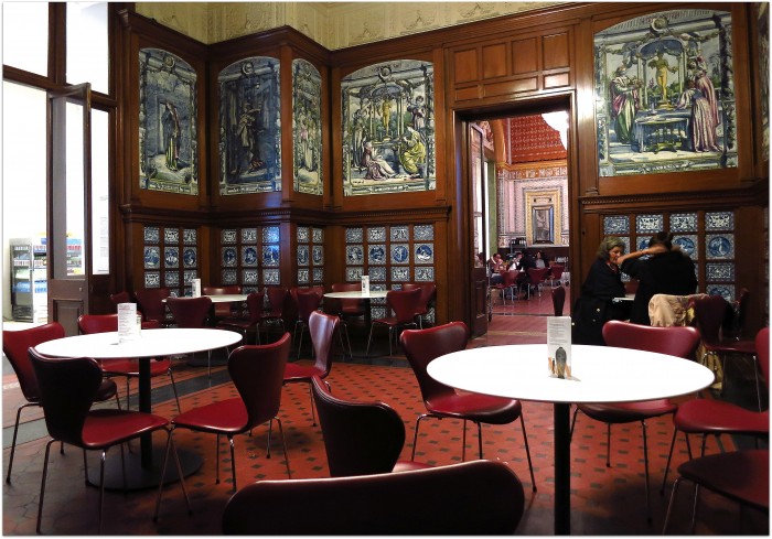
The easternmost room (now the Poynter Room) was originally called the Grill Room because it was fitted out to ‘broil chops and steaks’. It was designed by Edward Poynter using a scheme centred on blue Dutch tiles, and was furnished with little tables of iron with white marble tops and decorated in a similar style to the great iron stove.
Visitors could come here for breakfast when the Museum opened at 9am, watching the white-hatted cook prepare it on the stove.
Fred Hill, a catering contractor from the Oval, offered a long menu divided according to social standing. When you consider that in the 1860s an unskilled labourer might earn £1 a week, the food was not cheap.
In 1867 the first-class menu included:
-
Steak pudding 1/ –
-
Sausage and mashed potatoes 1/ –
-
Veal cutlets and bacon 1/3
-
Jugged hare 1/6
-
Cold chicken and ham 2/ –
-
Tarts in season 6d
-
Ices or jellies 6d
-
Stilton, cheshire, pickles, celery salad 3d
The second-class menu included:
-
Minced beef 8d
-
Veal cutlets 10d
-
Stewed rabbit 10d
-
Poached egg and spinach 1/ –
-
Steak pudding (large) 9d
-
Steak pudding (small) 6d
-
Buns and sponge cakes 1d
-
Bread, butter, cheese 1d
This room shows that in the latter part of the nineteenth century many designers, no longer content to draw inspiration only from European decorative styles, were influenced by the east and especially by Japan. The wave patterns on the doors of the stove, the peacocks on the frieze and in some of the tile panels, the flower motifs on the blue-and-white tiles, which all come from the east, are combined with the more conventional classical style of the figures representing the seasons and months of the year. Here again Cole involved both public and students in the Museum building.
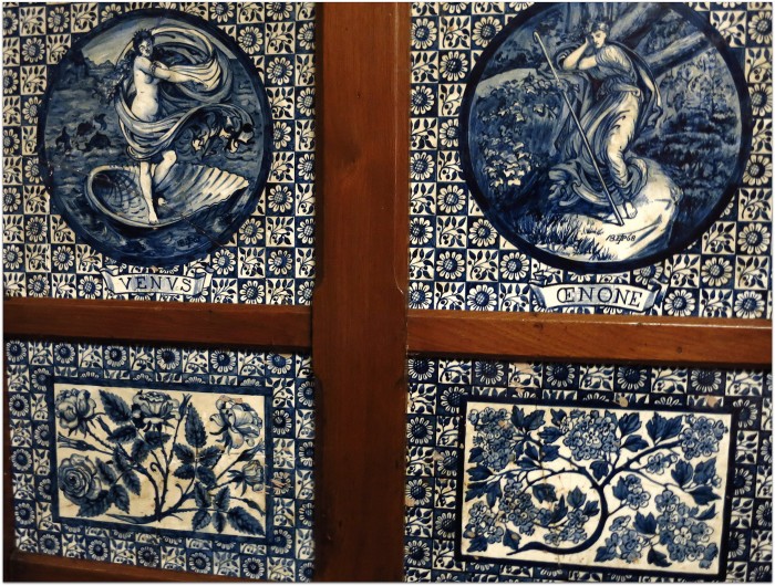
The public were encouraged by example to adopt this modem decoration in their homes. Students were involved on a practical level because the tile panels, designed by Edward Poynter, were painted by a special tile-painting class for ladies at the Schools of Design. The ladies’ tile-painting class was a bold move in 1860s society. It was unusual enough for women to train professionally, for them to be engaged in so public a commission was very forward-looking. This radical, free-thinking spirit at South Kensington was an element that was to find popular expression in the alternative ‘Art’ designs of the 1880
The Morris Room
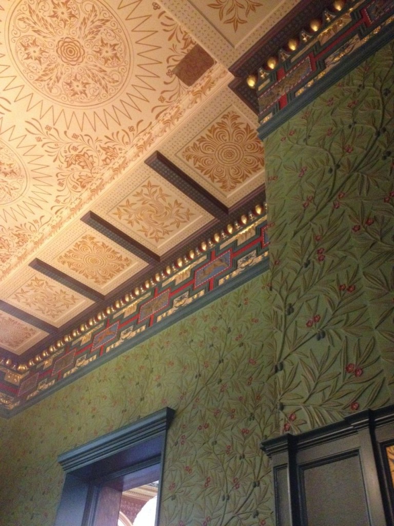
The westernmost room, originally called the Green Dining Room (now the Morris Room), was designed by William Morris and remains today as an important feature. The deep colours of the scheme show that at the time he was still under the influence of the Gothic Revival. He embellished the walls with Elizabethan-style panelling below a section of green plaster with a low relief of olive branches, while the stained-glass windows bore female figures painted by Edward Burne-Jones and Philip Webb.
Henry Cole was truly avant-garde in his determination that these three eating rooms should reflect the whole of contemporary design theory. William Morris is one of the most famous designers of the Victorian period. Although some of Morris’s ideas were foreign to Cole’s concept of progress, he recognized the truth and simplicity of Morris’ design ideas, and commissioned the interior of this room from Morris’ company, its first major work.
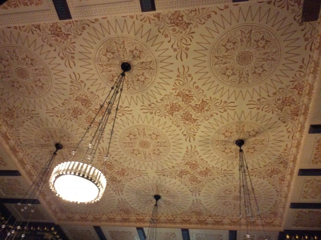
The room is subdued compared with the other two we have looked at. It shows the interest in myth and legend held by Morris and his friends, especially Edward Burne-Jones. Burne-Jones’ dado rail paintings are based on the signs of the zodiac and his designs for the windows show medieval domestic tasks. The rest of the decoration was probably by Morris’ friend the architect Philip Webb. Webb took his inspiration from a wide variety of medieval and ecclesiastical sources, including a font in Newcastle Cathedral for the frieze, and medieval manuscripts for the ceiling decoration. The only part of the decoration that is familiar Morris pattern-making is the repeat of leaves, flowers and berries in the plaster-work on the walls. Contemporary critics described the effect as ‘Tudor’, we would probably consider it another example of the rich eclecticism of the Victorian period.
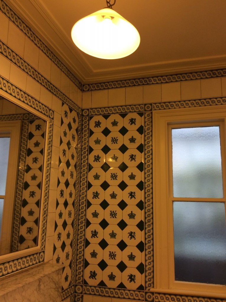
Even the loos are worth a visit, back in time as well..
